Building a design system architecture that scales
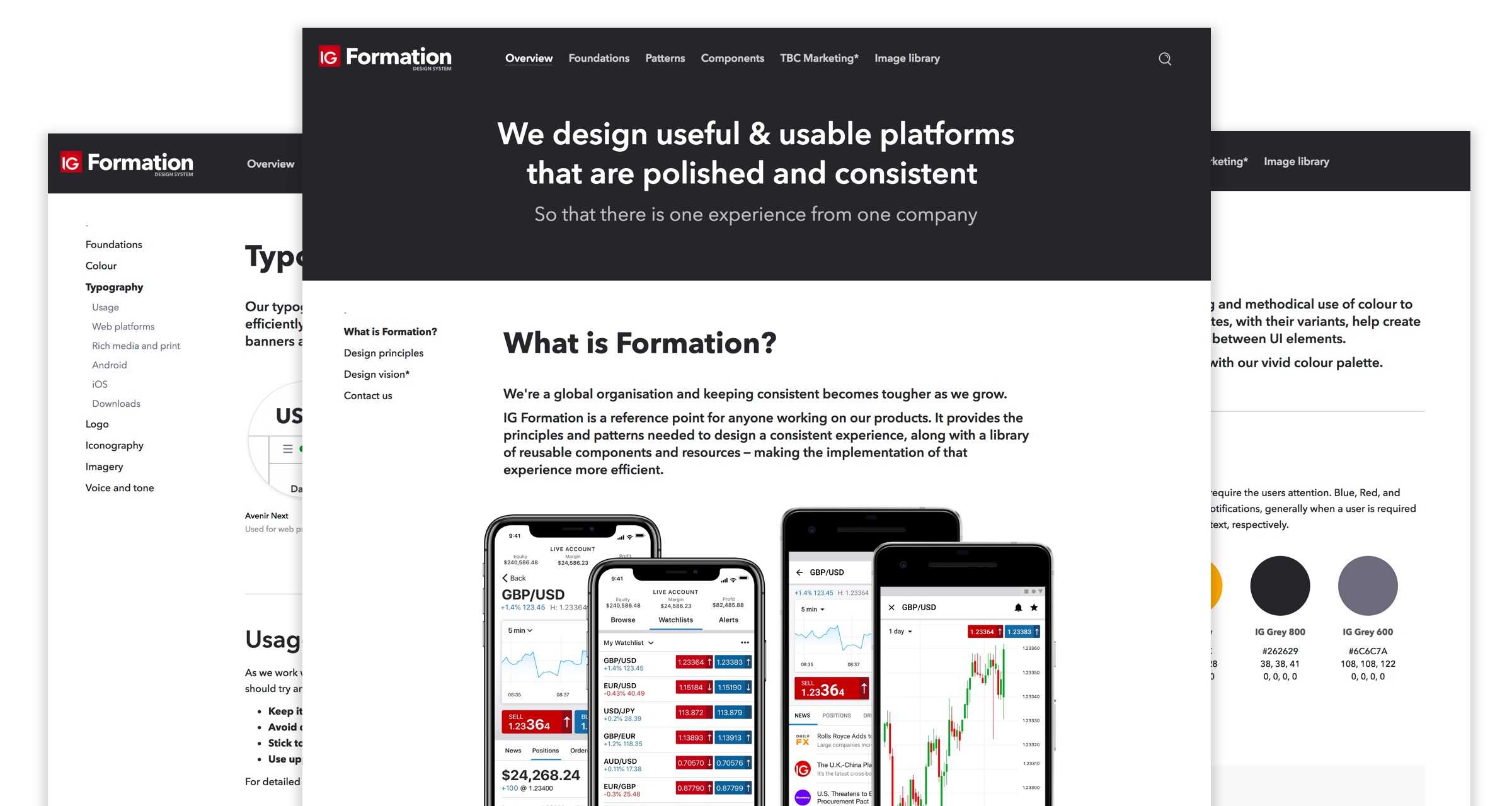
IG offers a multitude of products, from native apps to web-based trading platforms. As the company expanded to 17 global offices, Formation, IG’s design system, was created to unify these platforms, foster a shared understanding of design principles, and enable teams to work more efficiently.
Project history
I joined the team at IG to help redesign the web trading platform. My role was to define the visual language and lead the UI design for the platform. This would set the design direction for IG's other applications and formed the basis of the broader mobile and web platform style guides.
Although the platforms shared common styles, individual teams made decisions in isolation, leading to inconsistencies and duplication. Key principles were not documented and were only shared with new starters on an ad hoc basis. Ultimately, as the number of products grew, design processes needed to scale too.

Creating a brief
As the mobile UI lead, I worked with the Head of Product Design to create a system to unify and consolidate our principles. We needed a project brief, success criteria, senior stakeholder buy-in and a dedicated team to help make it happen.
The main objectives of the project were to improve the consistency of our products, build trust and create a cohesive experience for clients. We also wanted to improve our internal process by making the design process more transparent and collaborative. Crucially, we needed to scale our design output. Aligning creative and development teams globally meant we could avoid duplicating similar components across different platforms.
We created three indicators to judge the progress and success of the project, giving us a benchmark to improve upon.
Better onboarding – Does Formation give new starters the information they need?
Consistent patterns – Will subsequent design audits reveal fewer inconsistencies?
Simplified code – Can we build better apps using less CSS?
The process
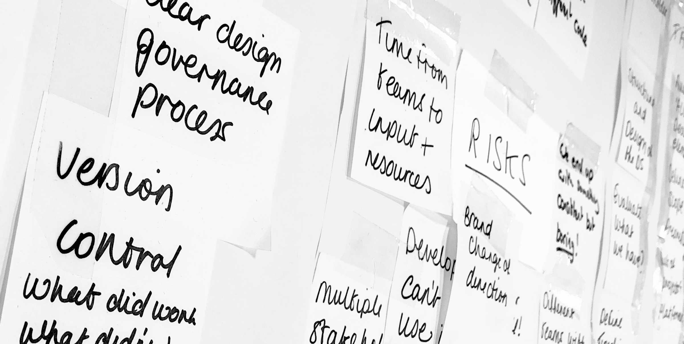
After creating the brief, my next task was to plan and help hire for the project. After we had formed a team, the remaining work fell into one of three main stages.
First was the design audit – combing through the different facets of IG's products and services, highlighting inconsistencies. The second was organising workshops to discuss the design direction and building consensus around the outcomes. The final steps were documenting the chosen approach and working closely with the engineering teams to create codified components for the different development libraries.
Consolidation
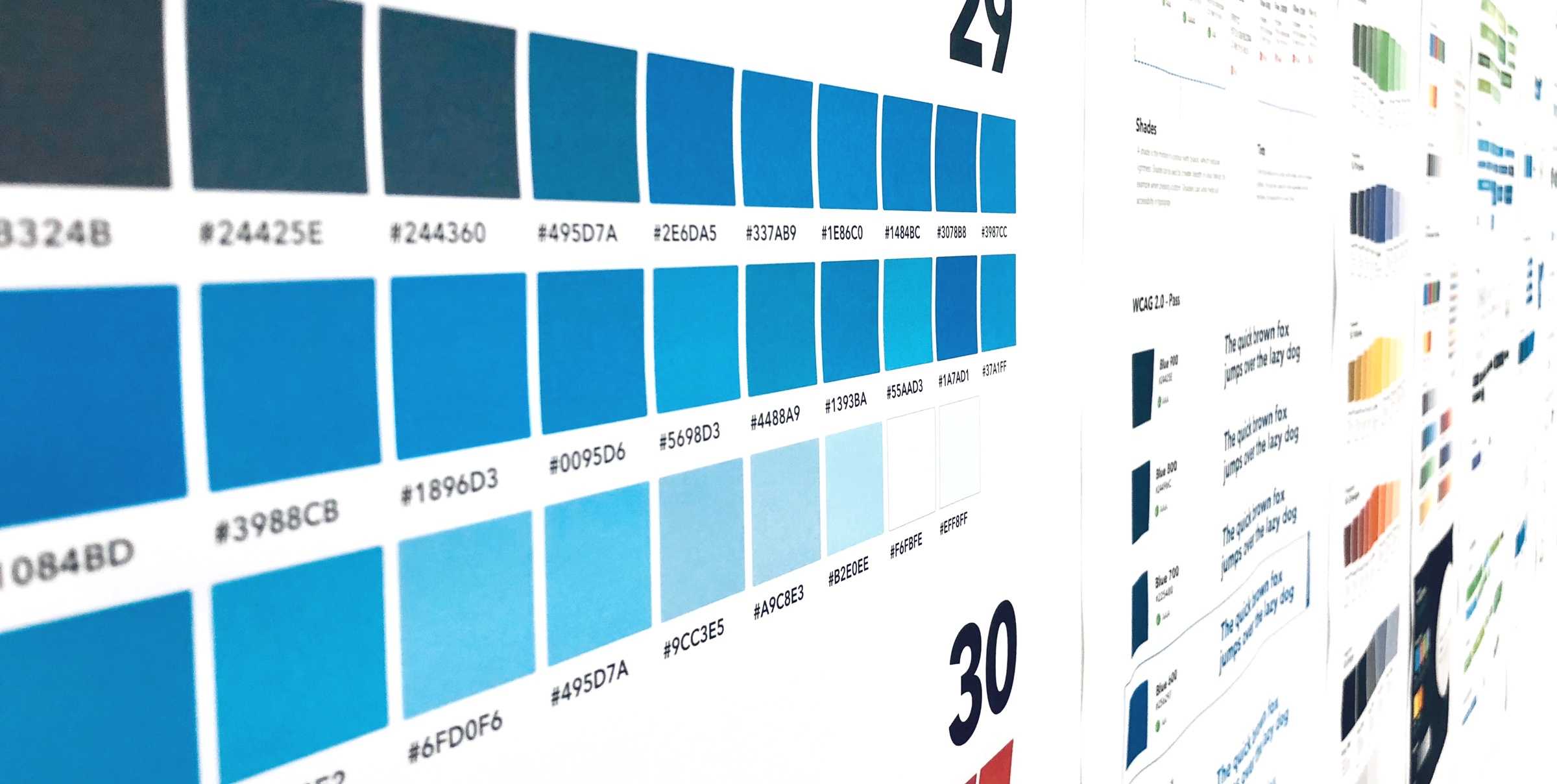
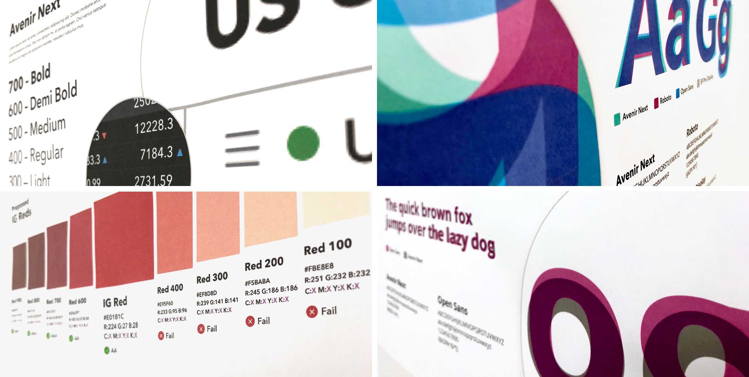
As described above, the design audit was key to evaluating the live apps. We assessed the marketing websites and communications, web trading and investment platforms as well as the mobile web and native apps. The focus was on finding inconsistencies in the patterns and styles used. This covered all of the basics including typography, colour, iconography, brand elements and tone of voice.
Next was a review of our design thinking and values. We had many project principles. Some aligned, others didn't. Working with the Head of Product Design, we pulled together all of the unwritten rules we used as a team to critique each others work.
Throughout this process we were collaborating with our international colleagues, presenting the system at regular intervals to teams around the world.
Building consensus
For the design system to succeed, it was important to build consensus from across the business. After the product and design thinking had been audited, I found advocates from each area of the business to offer insight and expertise – as well as act as ambassadors for the project
Formation
Once IG's brand elements, patterns and principles had been agreed, they needed to be documented. The first option was to build a custom framework and CMS. This would have made Formation the first 'product' designed and built using the new design system - a great way to test and 'dogfood' our principles. Unfortunately, due to time restrictions, Frontify's ready-made solution was the obvious MVP.
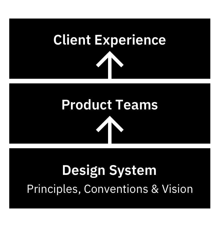
An important part of designing Formation was creating a structure that would enable it to efficiently scale with IG's growth. Formation needed to include a live inventory of UI components, style guides, assets, code snippets, developer guidelines and more. After a number of workshops and card sorting exercises we settled on three core sections: Foundations, Patterns and Components.
These three sections formed the core of the design system and represented different levels of complexity, offering greater detail and specifics around elements as you progressed.
01 Foundations
Foundations are the high-level principles and building blocks of any products design and development. They incorporate brand-wide rules that shape patterns and help to design consistent components.
02 Patterns
A pattern is a general, repeatable solution to a commonly-occurring problem. Patterns are agnostic solutions that can be used in many different situations. While each case will be different, it's important to ensure consistency in behaviour.
03 Components
A component can be a button, header, search box, icon or other piece of UI that can be wrapped in re-usable, well-tested and consistent-looking code. Smaller components are easier to design, test and reuse, but in some cases larger components can be useful if they are repeated throughout a company's digital estate.
Leveraging React
React is a powerful Javascript library for building user interfaces. It's also fast becoming a common language between designers and developers. With the release of prototyping tools such as Framer X it's now possible to design, prototype, develop and deploy a new component as part of one extended workflow. At IG I experimented with integrating production react components into the design system using Framer X.
Price Ticks
The need to show market price changes is a constant across IG products. For this reason it proved to be a perfect example of how to create innovative patterns using Formation. When designing the price ticks we referenced the existing foundations and patterns to design and build new components.


Outcome & Learnings
Building design systems is tricky. It relies on a huge amount of hard work and collaboration from across a business. It also requires a certain kind of mindset. Unlike the brand guidelines and style guides that came before, design systems are living entities that need to constantly evolve to stay relevant and useful.
My biggest learning from the project are:Start early, update often
It's so much easier to record thinking as it happens rather than retrospectively document changes. Make sure when you start a new project that you set a side time to document changes relevant to the design system.
Build a strong support base
Creating a design system isn't a job for one person or even a small team. It requires support and buy-in from a multitude of teams and stakeholders. Find people that are motivated and get them to help you build awareness for the project.
Get the level of detail right
Figuring out the right amount of detail to include in Formation was one of the biggest headaches of the project. Include too much and your system become dense and obtuse. Don't include enough and your team are left asking questions. The eureka moment for me was splitting the system into detail-specific sections. This allowed us to include a various amounts of detail at different stages on a 'need to know' bases.
