Creating a vision for the future of mobile trading
A product team needs a clear roadmap to build a good app, but building an exceptional app requires a shared purpose and ambition. In my role as the lead mobile UI designer, I worked to create a collaborative design vision that would inspire change and help reshape how people trade on mobile.
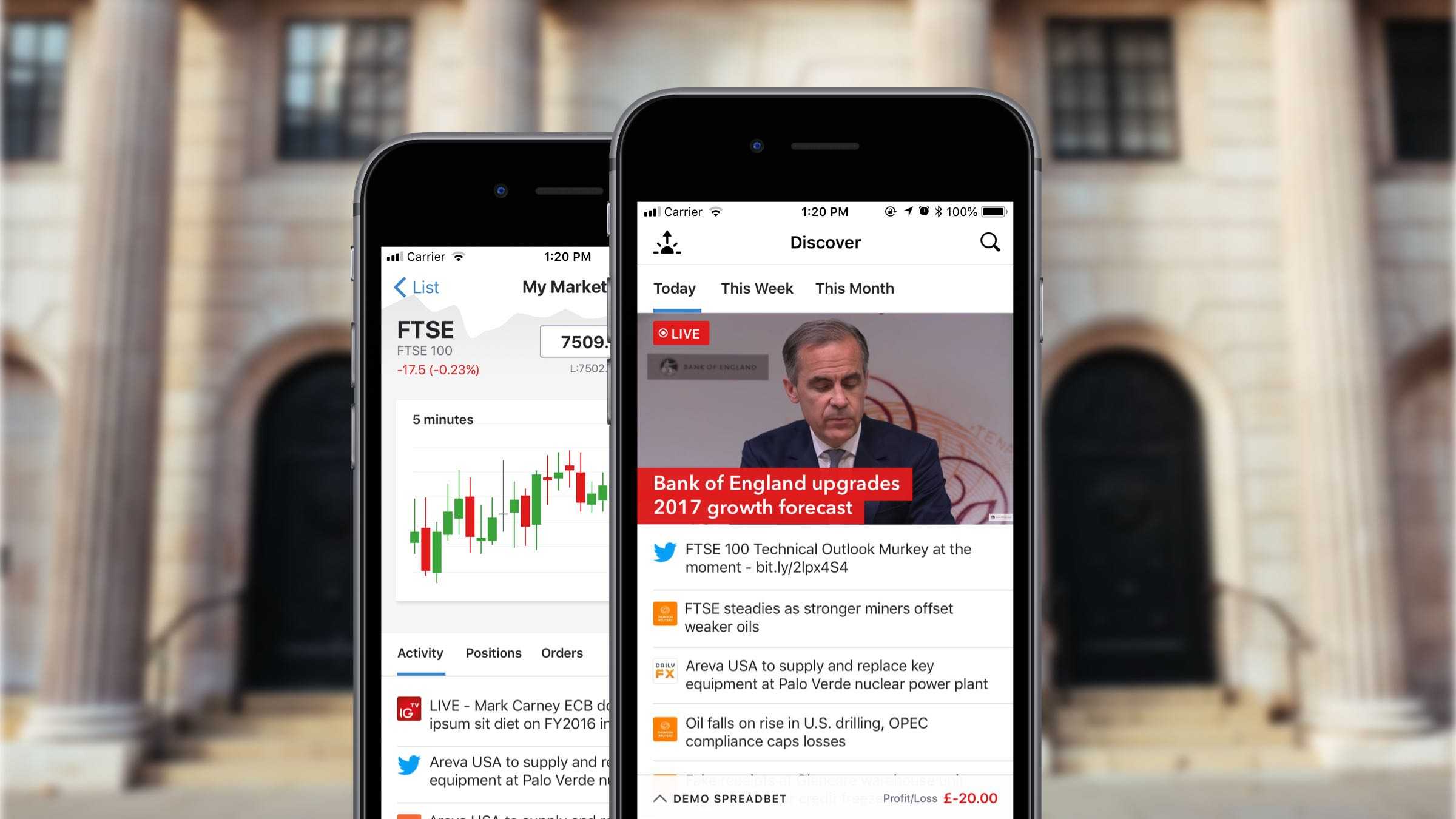
Creating a brief
The aim of the project was to create a long-term vision for mobile. A set of core concepts that could be integrated into the apps within 18–24 months. IG's mobile platforms had been stagnating and there was a desire to create a product that would be truly innovative. We prioritised streamlining key trading tasks and aligning the visual identity, functionality and common interaction. It was also important to understand traders' motivations in order to encourage behaviour that made them more successful and ultimately more profitable.
Key user tasks
To focus our efforts, we identified four key user tasks. These 'red routes' are the foundational user journeys that made our product most valuable and captured 90% of our traders' actions.
01 Register and manage an account
02 Identify opportunities to trade
03 Open a new position
04 Monitor, edit and close positions
State of play
The mobile trading apps hadn't been redesigned for years. They were experiencing growing pains caused by multiple discrete features added in quick succession. From a technical perspective, the codebase had become bloated and hard to maintain. From a design perspective, the look and feel of the apps was dated and disparate.
The iOS and Android apps had diverged, and some key flows had become convoluted. The architecture of both apps differed, but both were oriented around a hub-and-spoke style of navigation. The information hierarchy was relatively flat and dense. There was emphasis on showing a limited number of data points on as many markets as possible.
Platform alignment
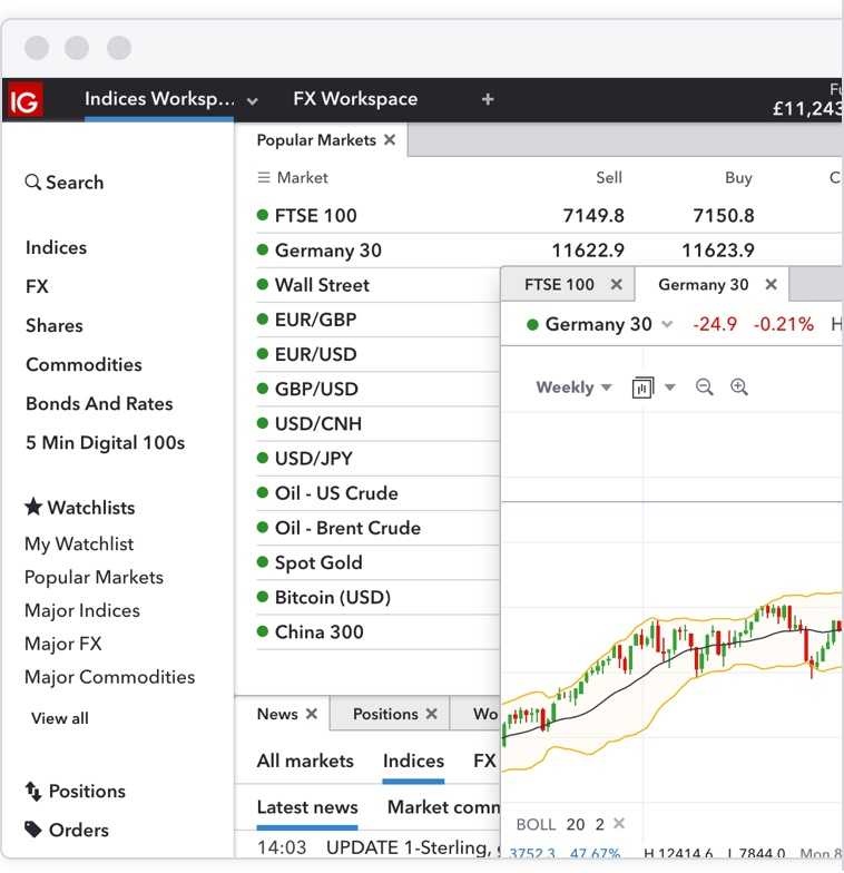
A big consideration was platform alignment. The recent redesign of the web trading platforms had been a catalyst for new features and ways of organising content.
The mobile vision needed to integrate these features in a cohesive way, while respecting the nuances of the native operating systems, creating a consistent but not uniform experience.
Research
Domain knowledge is scarce in the world of leveraged trading so finding experienced traders was crucial. We started by organising senior stakeholder interviews, including current or former traders, to get insight on their views of the apps. While I was initially keen to get their perspective on the apps' strengths and weaknesses, it also proved to be an opportunity to promote the project and its objectives.
The next task was collecting qualitative and quantitative data from clients. Again, starting with the existing app, we focused on trading data such as the number of trades placed, markets traded, average session times, popular devices etc. Next I worked with the UX research team to organise and facilitate high-value client interviews as well as focus groups for both existing and potential clients. IG hadn’t conducted mobile-specific research before, so I helped create a mobile testing rig. This included screen recording software, camera and audio equipment and networked test devices.
Key findings
We managed to collate a huge amount of research. Some findings were predictable. Others proved to be controversial and contradicted much of the conventional thinking that had gone before. Three of the most interesting data points are listed below. These findings greatly influenced the ideation workshops and design sprints that followed.

Design Sprints
Once we had a solid base of research to reference and the main objectives had been clearly defined, the next step was to create some design concepts.
It is important to have a broad set of skills and influences in the early stages of the ideation process. I organised and facilitated several design sprints to maximise the participation of team members and stakeholders, therefore generating the highest quality design concepts.
Planning
The design sprints followed a common structure and lasted a week each. We started with a team kick off and research presentation, followed by a planning session for the sprint's goals, testing and demo sessions.
Ideation
Day two started with a recap of the team's design principles and project goals. Sketching sessions and 'Crazy 8' style design exercises followed.
Day three was all about reviewing the ideas so far and planning the prototyping stage. This included paper prototypes or storyboarding exercises and was accompanied by a mid week review with stakeholders.
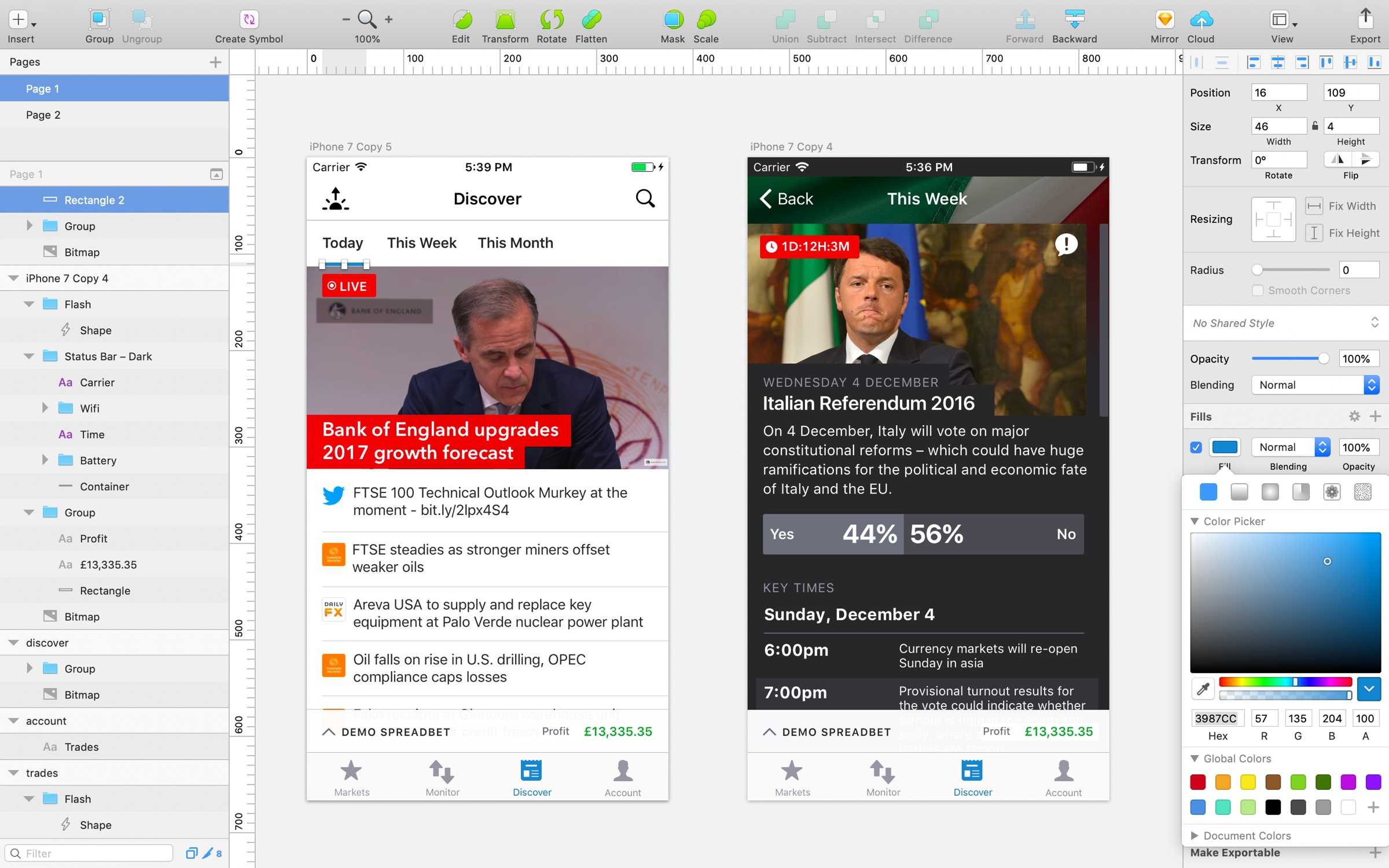
Prototyping
All of day four and the morning of day five were dedicated to prototyping and planning testing sessions. It's important that prototype fidelity is considered early on. There needs to be enough detail to prove the concept, but not so much that you waste time at the expense of iterating and improving a concept.
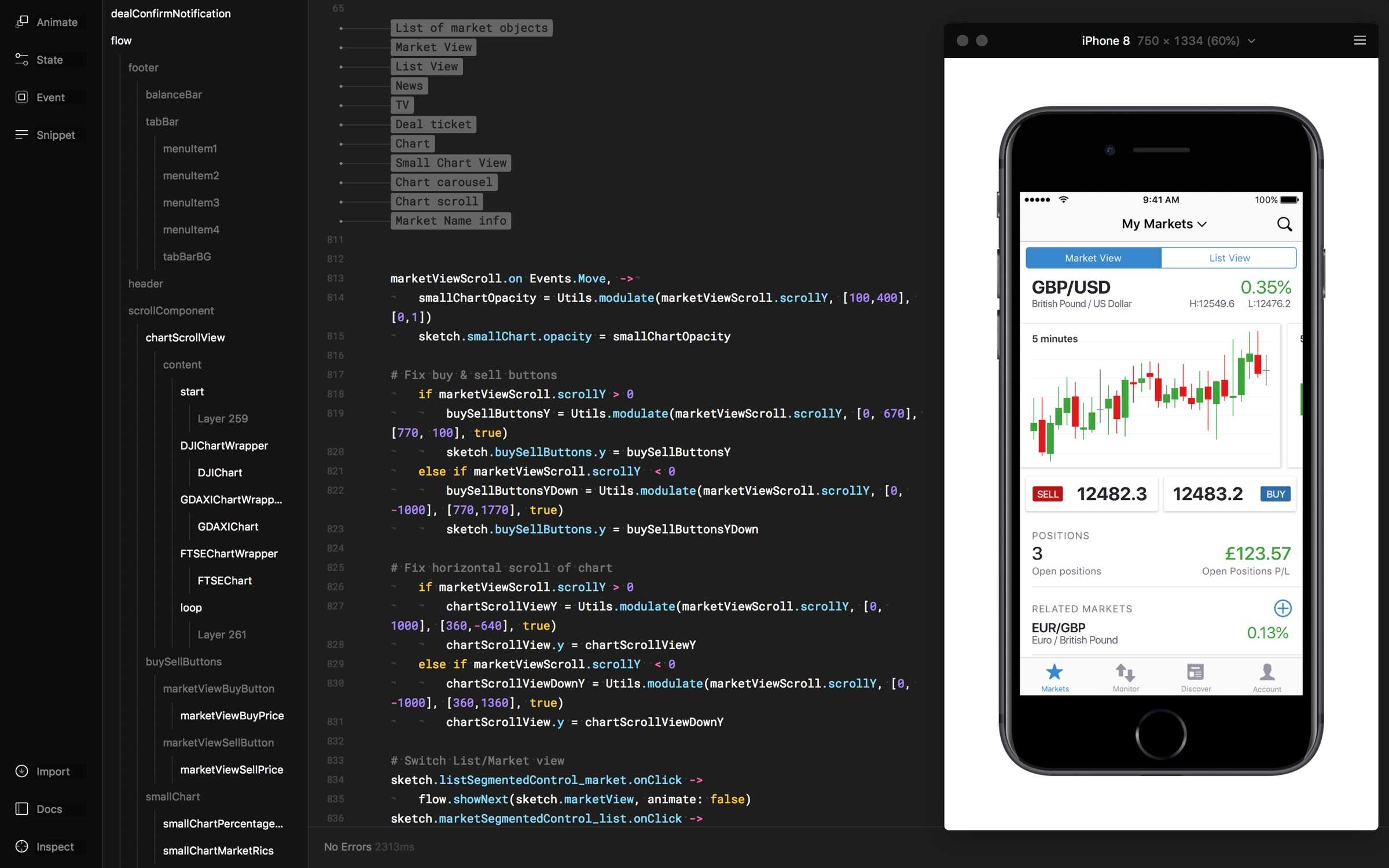
Framer is my prototyping tool of choice. It gives maximum flexibility, providing nested scrolling, pagination and modal dialogues out of the box. You can also use the physics engine and custom interactions to make something bespoke. The most valuable aspect during the mobile vision project was the ability to prototype with live data using IG's trading API.
Demo Day
Demo day was the highlight the week. A chance for the team to show off what they had been working on with the wider business, receive feedback and celebrate achievements. Where possible, prototypes circulated so that the demo audience could see them up close on their own devices.
It was also an important time to reflect and calculate our next steps. Are the concepts ready for further testing? Do they need another round of iteration? Or have you proven that the concept shouldn't be pursued at all?
User testing
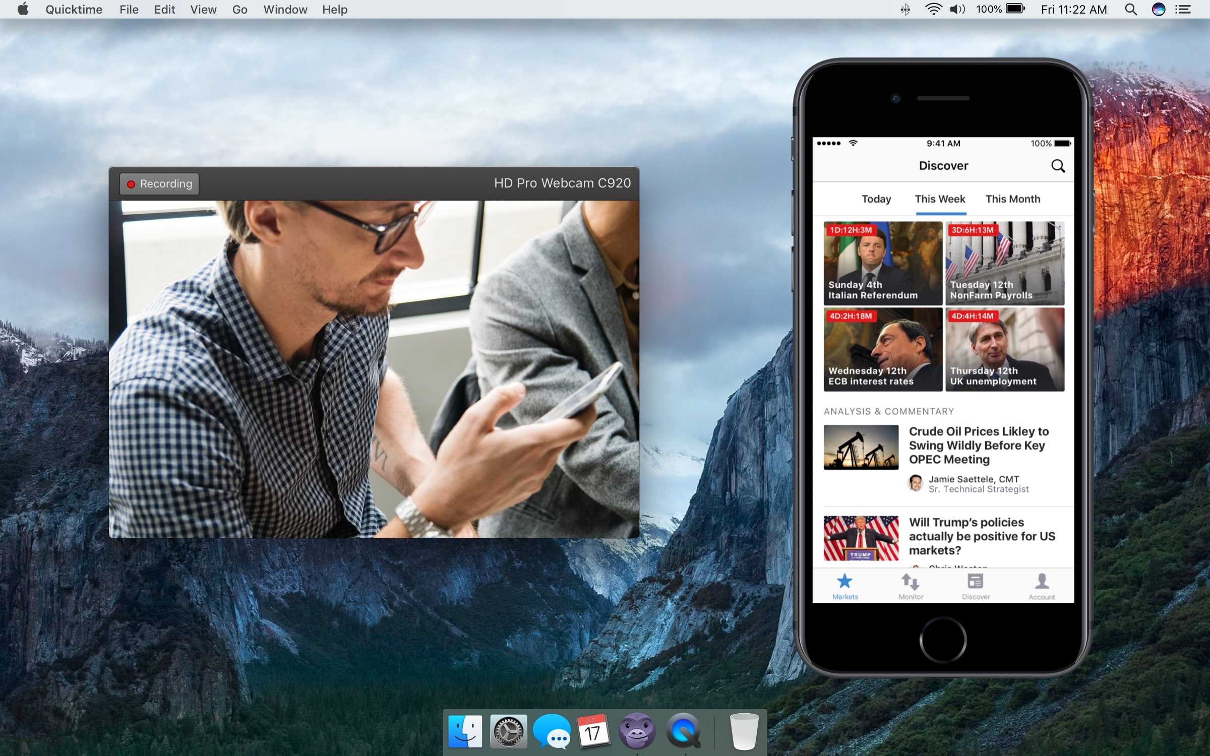
Testing sessions fell into one of two categories. The first happened early and often. We guerilla tested concepts as much as possible internally, recruiting IG dealers to validate technical concepts. The second focused on client's personal trading habits and preferences. These were organised in batches at key stages of the project.
In both cases, we needed a way of recording the sessions. As mentioned, this was a first for IG, so considerable time was spent developing a robust testing setup that could be used both in the office and remotely.
For the later stages of testing we used Framer prototypes to plug into the trading API, pulling in live market data and user details such as positions, balances and watchlists. This level of detail, again, was new ground for IG and required the input from several teams.
The effort was rewarded with exceptionally realistic testing sessions. Clients responded to prototypes based on their experiences using their own accounts and trading history.
Keep innovating
One of the biggest risks of the project was investing in solutions that could become technologically redundant. Due to the long timelines, the proposed concepts would need to stand the test of time. Our best bet was to focus on creating robust design principles and execute them using the latest mobile technologies.
Working closely with the development teams we regularly created proof of concepts based on the latest OS capabilities. We integrated features such as biometric verification, inline payments and native widgets to make key user tasks as frictionless as possible.
Swift nights
Originally set up as an opportunity for the iOS team to brush up on their skills, Swift Nights quickly became an important part of the mobile vision project.
By regularly attending the events – and encouraging other designers to do the same – we gained invaluable insight into the latest OS features and became a stronger, more rounded team in the process.
Design Vision
By the end of the workshops we had seven recommendations based around the original four red routes. We'd also experimented with a completely new app architecture and an aesthetic that aligned with the updated web trading platform.
While the prototyping and testing was carried out on iOS devices, the user flows were designed to be agnostic. This allowed for consistency between platforms with variations limited to the interface based on OS guidelines.
Medium-fidelity designs

Smart Onbording
Explore and personalise straight away
IG has always invested in supporting new clients. This historically had to be done without any upfront understanding of a client's trading knowledge or experience. By allowing clients to tailor the app at login, based on experience or trading style, IG can offer a more personalised experience.
Summary
Tailor your initial experience
Preview app before creating an account
Understand more about clients before calling
Trade Everywhere
Streamline the deal flow
Executing an order at the right second can make the difference between a profit or a loss. So quantifying the opportunity cost of interactions was vital. By keeping the ticket in context and aligning the design with IG's other platforms, we have drastically reduced the cognitive load and time needed to place a deal.
Summary
One tap deal ticket
Stay in context
Align details with the web platform
Market Centric Analysis
Bring together analysis & exposure per market
One of the biggest changes proposed in the design vision was a move from feature to task-based navigation. During the research we found that the vast majority of users only trade in three to five markets.
This contradicts previous thinking and opens new design opportunities. We switched from showing a small amount of data on many markets, to showing a lot of information on the most important markets.
This change also allowed us to move away from the hub-and-spoke style navigation to point-to-point focused one. This drastically reduced the amount of steps in key user flows, allowing us to make switching between markets easier.
Summary
Collate market information on one screen
Only see relevant content
Swipe between markets and charts
Consolidate Trading Activity
Trading Activity in one place
The second new section is Monitor. In the current app, pending, open and closed orders are all separate areas of the app. With the new architecture they are brought together in one 'Trades' tab. The 'Trades' tab focuses on the task of managing exposure and allows users to see the entire history of an order easily.
Summary
Open, pending and closed orders all in one place
More information available on lists
Customise to your trading strategy
Discover new opportunities
Awareness of other interesting markets
A consequence of reducing the prominence of watchlists is that it becomes harder to find opportunities in unfamiliar markets. To compensate for this, we proposed a task-based section called 'Discover'. There, users could see trending markets , breaking news and press coverage as well as details about upcoming economic events – all without leaving the app.
Summary
Explore without leaving the app
Markets relevant to trading activity
Task rather than feature based navigation
Manage Accounts
Visual Account health and inline funding
The final task-based section of the app is account management. Here we grouped all of a user's common account-based tasks and visualised key balance values. We also designed ways to allow some tasks to be done in context. A good example is payments. Instead of navigating away from a task to deposit funds, users can leverage Apple or Google Pay to deposit straight from a deal ticket.
Summary
Graphical account health
Inline funding
Account activities in one place
Increase engagement
Reduce Friction and increase visibility of IG
Another key statistic from the research showed that a large proportion of sessions were for under ten seconds. These short but frequent logins were to check account health and balances. The last recommendation was to reduce the need to log in to see account health information by integrating better with the mobile OS. This would include using home page widgets, richer notifications and shortcuts.
Summary
Monitor and research without frequent login
Widgets expose key information outside the app
Show charts in notifications
